
Whiterose Properties is a Nigerian real estate developer selling residential and commercial properties across Lagos and Abuja, with flexible payment plans as a core part of their offer. This redesign covered the full site spanning the homepage, property and project pages, Leadership & Governance, About Us, Services, Partners, Contact, CSR & Impact, Careers, Blog, the Network Portal / Investor Login areas, 8 microsites added just to mention a few.
The original Whiterose Properties website contained valuable information, but the overall experience made it difficult for users to quickly understand the company's offerings or complete key tasks such as exploring properties, learning about services, or making enquiries.
The interface suffered from inconsistent layouts, dense content blocks, weak visual hierarchy, and repeated use of similar components that competed for attention instead of guiding users through the experience. Important actions such as browsing properties or contacting the company were often buried beneath lengthy sections, increasing cognitive load and reducing scannability.
As a concept redesign, my objective was not to change the company's brand identity, but to improve the overall user experience by creating a cleaner information architecture, establishing a consistent visual system, and designing interfaces that help users move confidently from discovery to enquiry.

I conducted a heuristic evaluation using Nielsen's usability principles to identify the most significant usability issues before beginning the redesign.
Findings | Impact |
|---|---|
| Weak visual hierarchy | Users struggled to identify the most important content and actions. |
| Row Dense content sections | Large blocks of text reduced readability and discouraged scanning. |
| Inconsistent spacing and alignment | Components lacked rhythm, making pages feel cluttered. |
| Repetitive layouts | Similar sections blended together, making it difficult to distinguish different content types. |
| Call-to-action inconsistency | Multiple button styles reduced emphasis on primary actions. |
| Poor information grouping | Related information was spread across pages without clear relationships. |
| Limited visual cues | Icons, imagery, and spacing were underutilized to support comprehension. |
| Accessibility concerns | Small text, inconsistent contrast, and cramped layouts affected readability. |
These findings established the design priorities for the redesign and ensured every design decision addressed a genuine usability issue rather than simply refreshing the visual style.
The redesign focused on creating a user experience that better supports users throughout their property search and decision-making journey.
The primary goals were to:
Improve visual hierarchy so users can quickly identify important information.
Simplify navigation and reduce cognitive load.
Create a scalable design system with reusable components.
Improve readability through better typography, spacing, and content grouping.
Increase trust by presenting company information more professionally.
Make calls-to-action more visible and purposeful.
Improve accessibility using better colour contrast, spacing, and larger interaction targets.
Create layouts that adapt naturally across desktop and mobile devices.
The redesign extended across the website's broader digital experience, with improvements made across its pages, user journeys, and content types. The screens below provide a snapshot of the transformation, featuring selected pages from the wider redesign.
For each comparison, I’ve highlighted two representative problems → solution relationships. These annotations illustrate specific design decisions, while the full screens showcase the broader changes in hierarchy, organization, consistency, usability, and visual experience.

1
Single CTA path no route for a visitor who already wants to talk to someone.
2
Property discovery buried below a full paragraph of company narrative.
3
Dual CTAs added; search, plus a direct "Contact Us Now" / "Schedule Inspection" path.
4
Featured Properties moved directly after the hero reusable card component used sitewide.

1
Board of Directors shipped with grey placeholder boxes instead of photos.
2
Org chart shown as solid-color blocks reads like a wireframe.
3
Real headshot photos populated for every director.
4
Org chart rebuilt as a clean outlined hierarchy tree.
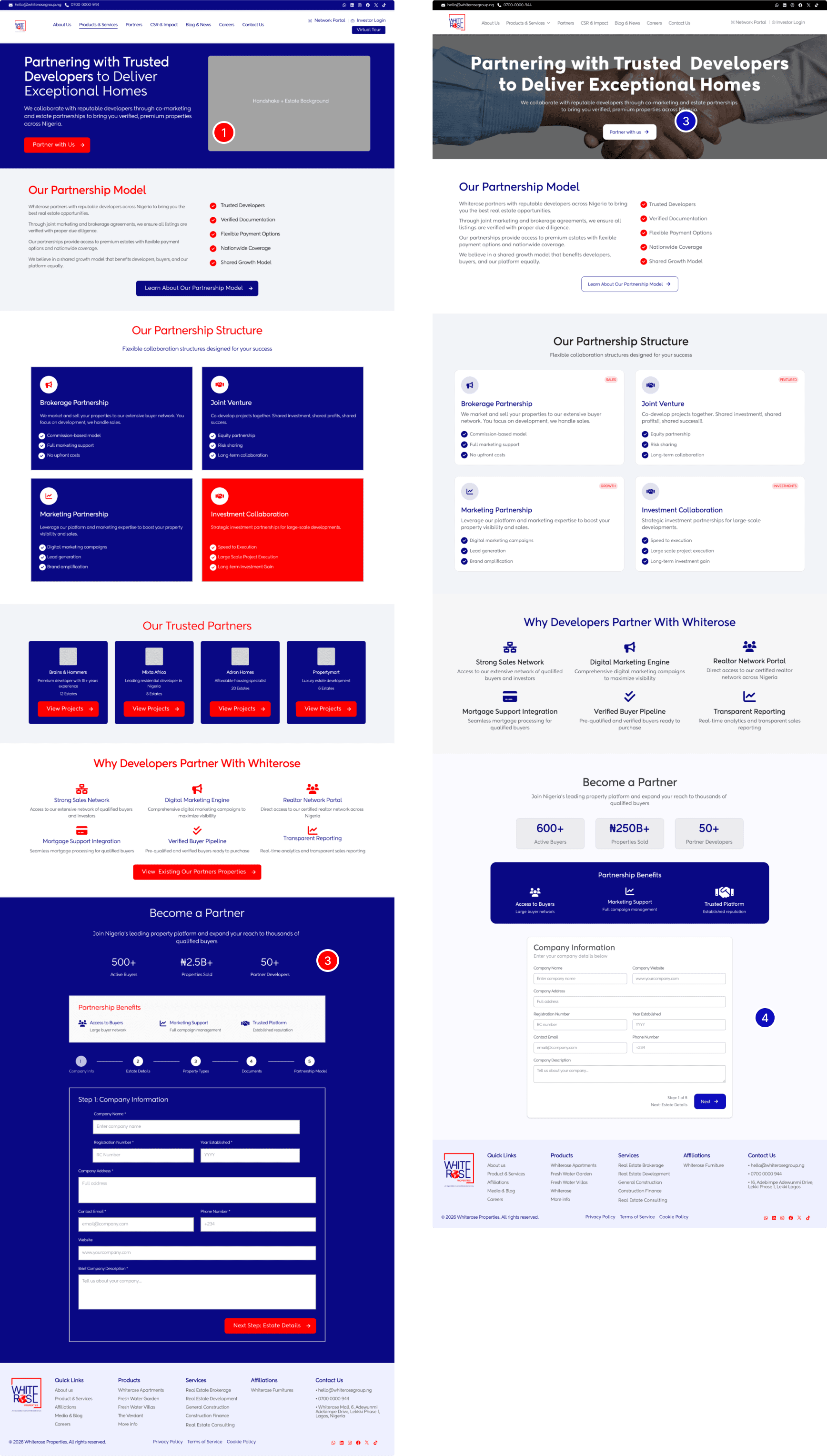
1
Contact details (phone/email/address) appear twice, once in the top header bar, then repeated in three large cards below the form.
2
Five-section partner application rendered fully expanded on one page.
3
Sidebar + form now sit side-by-side in one card, both visible without scrolling.
4
Application paced into steps "Step 1 of 5" with a clear Next action.

1
Contact details and enquiry options compete within a dense contact section.
2
Long, single-column enquiry form creates unnecessary visual and cognitive load.
3
Contact information and enquiry form separated into a clearer two-column layout.
4
Form fields reorganized into a compact, structured layout for easier completion.
Established a stronger visual hierarchy: Typography, spacing, color, and section sizing were used intentionally to direct users toward key information instead of competing for attention, most visibly in pulling red back from every button, checkmark, and background to much fewer deliberate roles.
Reduced cognitive load: Long paragraphs and long forms were broken into digestible pieces; modular cards on About and Services, a stepped flow on the partner application, so users can scan or complete tasks without being shown everything at once.
Introduced reusable UI components: Cards, buttons, stat blocks, property listings, and testimonial sections were rebuilt into one consistent pattern used across the entire site, replacing the solid-color blocks that varied page to page.
Improved information architecture: Related content was grouped logically, contact info consolidated into one sidebar instead of duplicated, properties moved earlier on the homepage, reducing unnecessary scrolling and repetition.
Increased trust: Leadership profiles, project portfolios, awards, and company statistics were given more visual prominence and finished production quality (no visible placeholders), which matters more for a real estate purchase than most transactions.
Optimized calls-to-action: Every page now emphasizes one clear primary action with a consistent secondary option, replacing the inconsistent red/red or red/white pairings from before.
This wasn't a formal audit, but decisions throughout were informed by WCAG principles and standard usability practice:
Improved color contrast by pulling red back from repeated, indiscriminate use to a single deliberate role.
Consistent heading hierarchy and larger, more legible typography across all pages.
Larger, more consistent button and form interaction targets from the unified component system.
Increased whitespace and more predictable, repeatable layouts to reduce cognitive effort.
Clearer labeling; the Contact page's inquiry tabs were reduced and reorganized for easier scanning, particularly for keyboard and screen-reader navigation.
A full WCAG contrast and keyboard-navigation audit is a reasonable next step to formally validate these improvements.
As this was a redesign concept, no live analytics were available to validate performance pre-launch. Expected improvements:
Faster navigation through clearer information architecture.
Improved property discovery, with listings surfaced earlier and browsable instead of buried.
Higher visibility of primary calls-to-action through consistent hierarchy.
Reduced cognitive load through modular content and a paced application flow.
Increased trust through consistent, finished, professional presentation.
Better scalability; new pages can now reuse the existing card, hero, and CTA components instead of being designed from scratch.
This project reinforced an important design principle: effective design is less about creating attractive interfaces and more about helping users accomplish their goals with clarity and confidence.
Working through the redesign challenged me to think beyond aesthetics and consider how information architecture, hierarchy, consistency, and interaction patterns shape the overall experience. Rather than redesigning individual pages in isolation, I approached the project as a connected system, creating reusable components and patterns that improve consistency across the website.
Seeing the redesign implemented also highlighted the importance of designing solutions that are not only visually compelling but practical to build and scalable over time. It reinforced the value of collaboration between design and development, ensuring that design decisions could be translated into a functional, cohesive product without compromising the user experience.
If I were to continue iterating on the product, my next step would be to evaluate its performance through usability testing and analytics. Gathering insights such as task completion rates, enquiry conversions, user engagement, and qualitative feedback would help validate the design decisions and identify opportunities for further improvement.